Shades of Blue
If you're looking for living room design ideas here's a tried and true color combination. Blue and white is a classic color combination that seems to never get boring or go out of style. There are so many variations of a blue and white color scheme, the options are endless.These two colors can work well in any room of your home, from kitchen to dining, or your living room to den. It's a color palette that can be dressed up for a formal elegant vibe or dressed down for a comfy casual vibe. And of course blue is beatiful in bathrooms. But for now well forcus on this blue and white living room giving tons of inspiration for your own space.
I love a dramatic wall. It's like a beautiful gown or Sexy black dress and the furnishings and decor are the gorgeous shoes and accessories. When you pull it all together the look is gorgeous. Well to me that's the same with a space. A painted wall is beautiful and furniture and décor is also beautiful, but it doesn't look stunning until all the pieces are put together.
Could you pull this look or similar off in your own home? Of course you can. The best way to do this is to focus on what you actually see in this design and recreate with a very close match if not the exact.
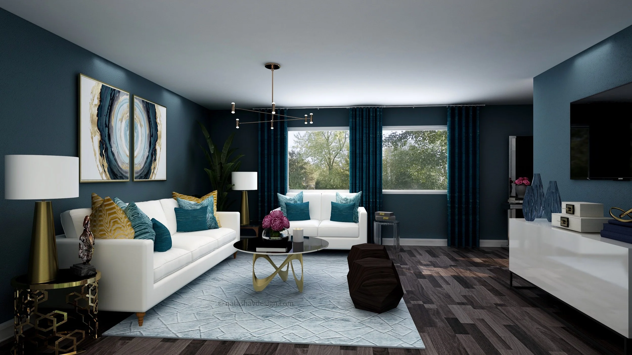
So I'm just going to jump right in and give you the deets for this space. The walls are Sherwin Williams Loyal Blue. I know, I know it looks on the teal-blue side. Since the paint manufacturer named it blue I'll stick with that. Important note: make sure this is the color that actually shows up on your screen. My suggestion is to get this paint chip from Sherwin Williams. Get a larger sample size if possible. Make sure it's from the Sherwin Williams brand. Each brand has it’s on paint base, therefor color matching may not result in the true Loyal Blue color.
Another reason this is important is because the actual paint color and the color on your screen may appear different. If you find this to be true and you like the color on your screen, than find the color that is a match to what shows on your screen or have it color matched. It may end up being a custom color. I do recommend sampling the paint in your home first.
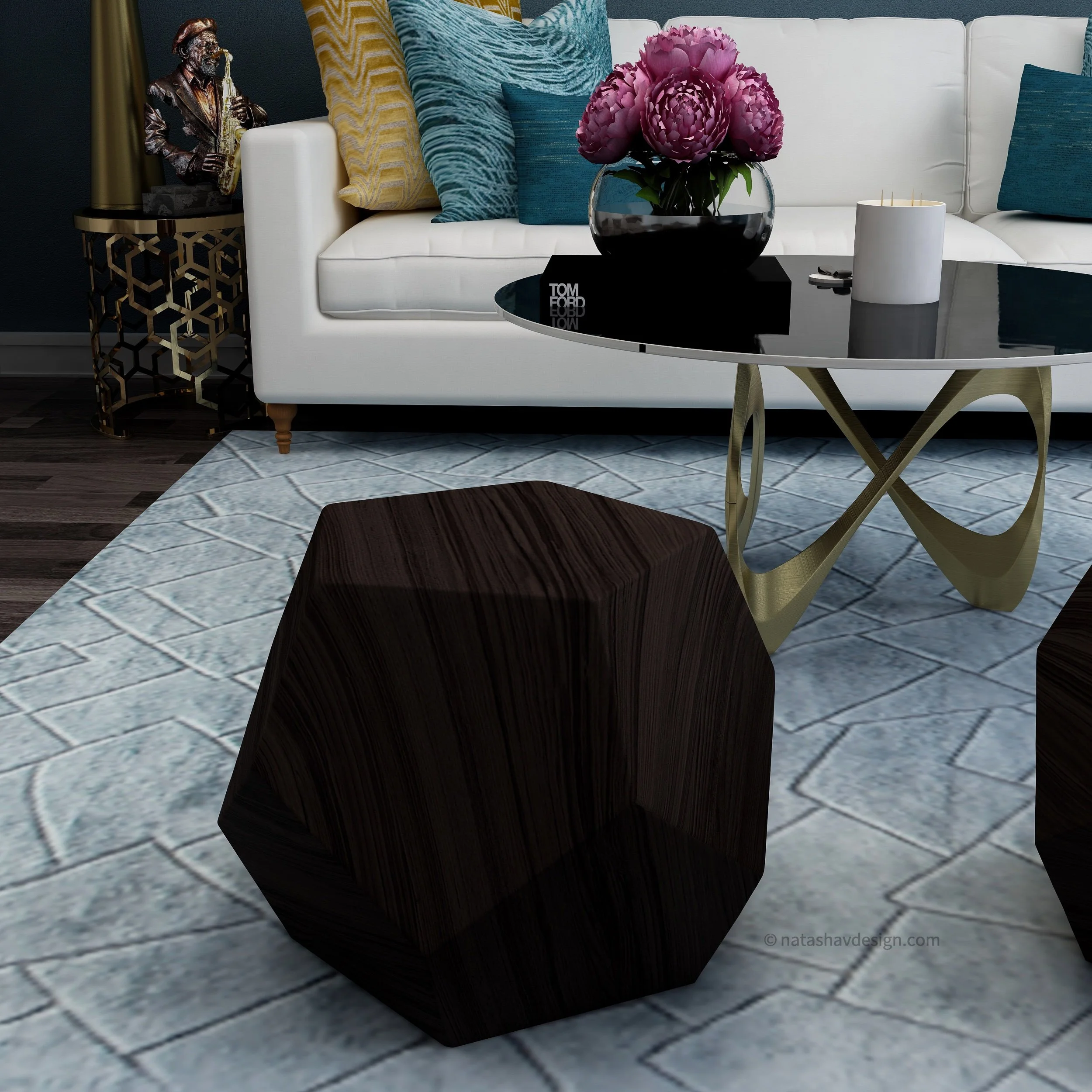
In this design concept all the walls are the color Loyal Blue and the ceiling is white. This is a bold dramatic look. The floors are a dark wood which adds a richness to the space.
Contrast is important when going for a strong bold look as this one. The white sofa and loveseat bring in contrast to the dark walls. In this design I selected matching sofa and love seat. I'm not a fan of matchy matchy but it truly works here.
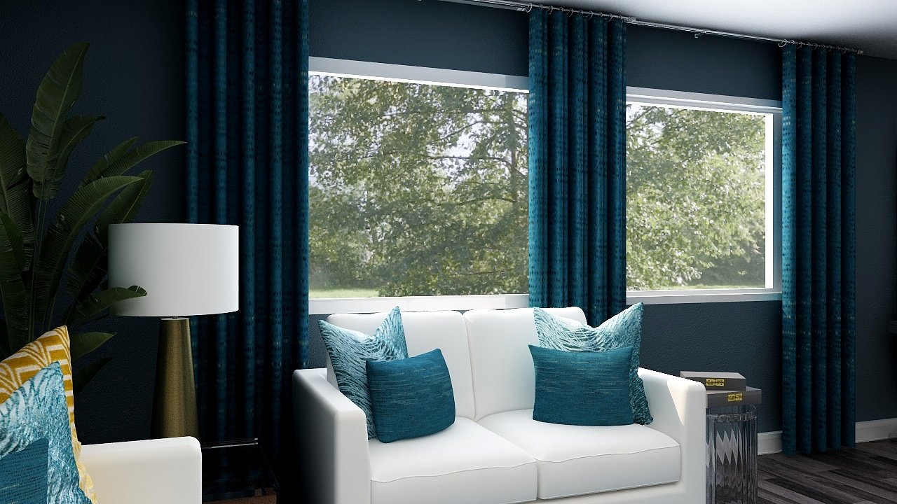
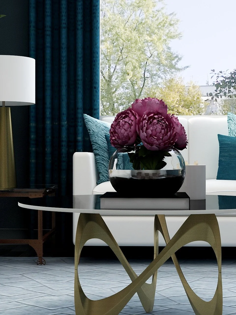
So you got the deets on the paint, lets talk about window treatments. Window should never be ignored or taking lightly. They can compelete a design or make it a flop. Custom drapes can really enhance your space. Selecting a drapery fabric that complents the design can take time but shouldn't be rushed. It's OK to wait for what you want rather than just grabbing the first thing available. Drapes look best when they brush the floor. Please no highwater drapes.
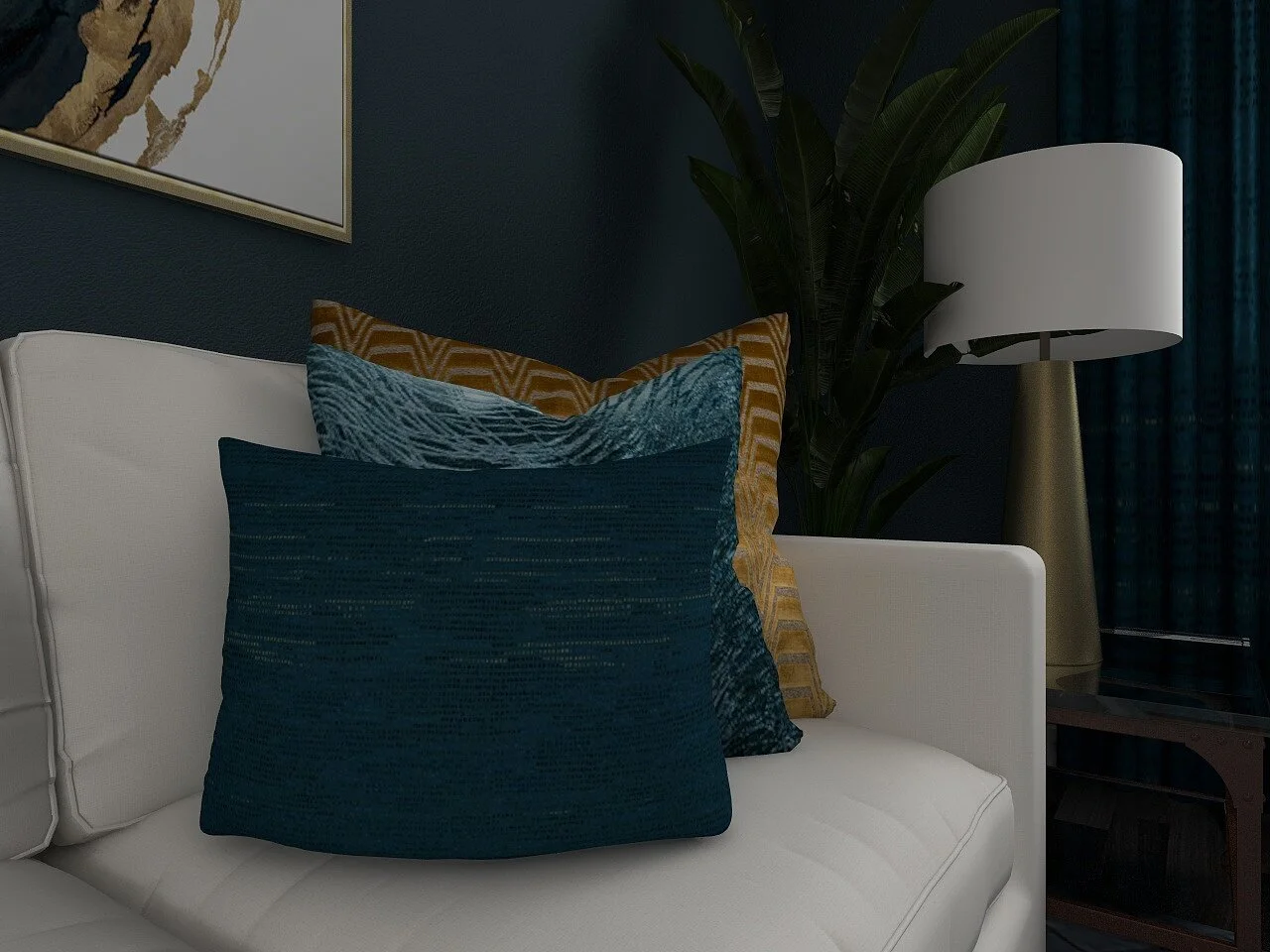
For this particular design I selected a fabric in a deep blue with texture and slight gold tones. These are custom drapes using Kravets fabric. The gold tonrd pick up the gold accents used elsewhere in this design and pull from the gold in the artwork
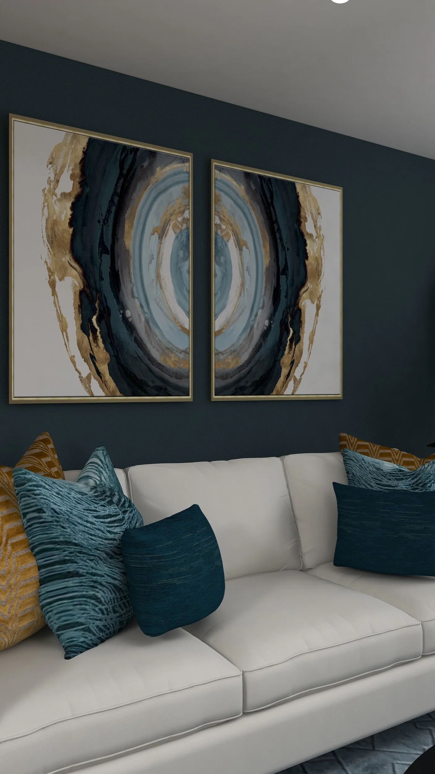
Paint, Drapes and now the acessories. Abstract artwork full of bold blues and gold. But note it is not the exact shade of blues as the wall. That's one great thing about color, different shades of the same color can make stunning accent pieces. Because the painting has multiple shades of blue, it was the inspiration for the accent pillows.
I selected two pieces of the same wall art and arranged them facing each other. Having two pieces made the scale of the overall artwork larger and they aren’t competing with each other. When you use bold colors, vibrant artwork and accessories make sure there is flow, balance and harmony. You don't want items to look odd, out of place or clash with one another.
Why abstract? I wanted a focal point for when your enter this space, something to grab the eye. Abstract is one way to do this. And it's unpredictable
Now about this rug. This rug is a subtle geometric pattern in a lighter shade of blue similar to the pillows and lighter blues in the wallart. I went with a subtle rug because I wanted the abstract art and dramatic blue walls as the focal point.
Lamps allowed me to bring in a little more gold, not to much but just enough. These lamps are about 29" in hieght. I wanted them to anchor the space, which I feel they do.
Lastly is the coffee table and mixed end tables. The coffee table I kept simple with beautiful flowers, a book and candles. The end tables are pretty simple as well with no more than 1-2 items styled on each of them. I used the end tables as an opportunity to not only bring in a little more gold, but bring in some unexpected elements that still reflected this sophisticated look.
Recreate a similar look in your own home. So if your heart is set on creating a bold, blue and beautiful living room click here and get stated.
This room is beautiful and can be completed independently, but if you find you would like more one-on-one help designing your space or a customized design check out my VIP eDesign services here.
I hope you enjoyed this design and the details of how to recreate it in your own home. Make sure your on my “More Designs” mailing list for newly released living room design ideas.
Chat with you soon!
NaTasha